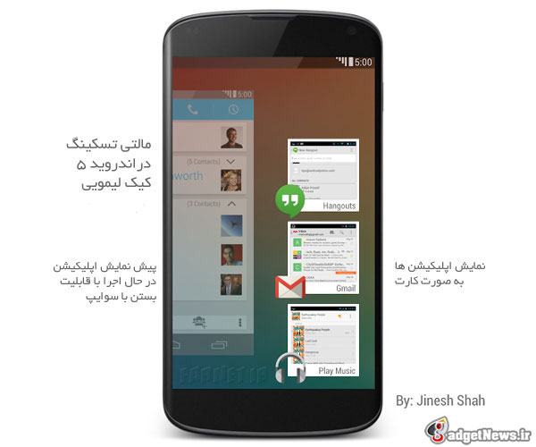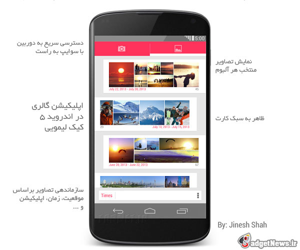
میدانیم آپدیت بعدی . اساسی سیستمعامل اندروید نسخه ۵ با نام کیک لیمویی یا Key Lime Pie خواهد بود. امروز چندین تصویر زیبای مفهومی از طرح آینده اندروید ۵ را برایتان آماده کردهایم.در ادامه با گجت نيوز همراه باشيد
این تصاویر که توسط “جینش شاه” دانشجوی خوشذوق دانشگاه میشیگان طراحی شده است یک طرح مفهومی و پیشنهادی است که در اکانت گوگل پلاس او قرار داده شده و اخیراً توجه بسیاری کاربران و کارشناسان را به خودش جلب کرده است. این طرح بر اساس طراحی کارتی شکل Google Now شکل گرفته و سادگی و زیبایی آن تحسینبرانگیز است.


منبع : droid-life
Android 5.0 “Key Lime Pie” UI Concepts Hitting the Web, Give Us Very High Hopes
As we approach the rumored date for Android 4.3′s launch on June 20 (at least, that’s what our sources say), many have already come to the realization that we should not expect Google to introduce a new interface for the OS. It will still be called Jelly Bean and nothing too crazy will happen. What most in the business have their money on is that we can expect to see Google change up Android’s look in the iteration after next, being Android 5.0 “Key Lime Pie.” That’s when we will see some new colors, icons, wallpapers, etc. take place.
Graphic designers appear to be already creating their very own concepts for what they would like to see in Android 5.0, playing more with lockscreen widgets and revising the Android homescreen look. Artist Jinesh Shah took to his Google+ page recently to post up a few pictures of his own ideas, some of which we have become big fans of. While it comes off as minimal and clean, there is enough information on any given homescreen and the lockscreen to give off the sense that this concept would be highly functional and practical for users.
The lockscreen widget shows a comprehensive look at this user’s upcoming meeting, even showing a map preview of its location. Below that, we can see upcoming flight details, all of which would be able to be customized under new settings that would come with KLP. As for the homescreen changes, what sets this concept apart from others is the idea of “hidden” widgets. With swipes and other gestures, you could reveal other widgets that don’t necessarily have to be on your homescreen when not being used. It’s a fantastic concept, one that we probably wouldn’t mind seeing implemented.
 گجت نیوز آخرین اخبار تکنولوژی، علم و خودرو

