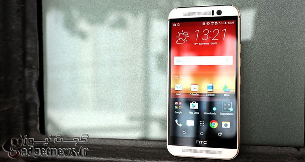
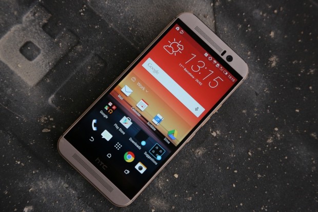
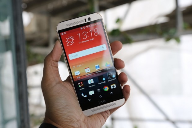
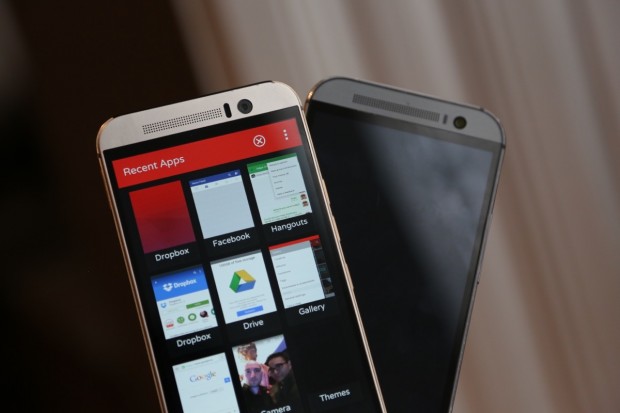
سرانجام یکی از پرچم داران مهم سال 2015 رسما معرفی شد.دقایقی پیش ، کمپانی اچ تی سی رسما از پرچم دار جدید خود اسمارت فون HTC One M9 پرده برداشت.وان ام 9 با بدنه ای تما فلزی و نمایشگر 5 اینچی 1080p عرضه شده است.در ادامه با گجت نیوز همراه باشید.
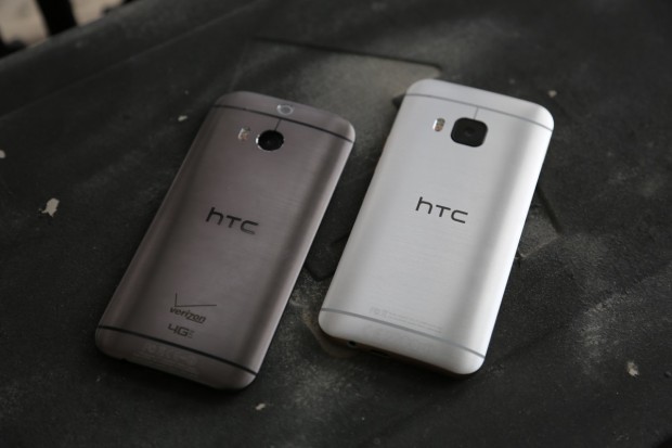
متاسفانه ( و یا شاید هم خوشبختانه ) وان ام 9 نیز طراحی مشابهی با پرچمدار سال گذشته HTC داشته و بجز تغییر جایگاه کلید پاور و تعدادی تغییر جزئی دیگر در کنار دوربین تکی پشتی، تفاوت دیگری با نسل قبلی مشاهده نمیشود.این بار اچتیسی در طراحی گوشههای کناری پرچمدار خود از رنگهای طلایی و نقرهای بهره برده و بدنهی اصلی دستگاه نیز از آلومینیوم برسخورده است.
پرچمدار 2015 اچ تی سی همچون گذشته به اسپیکرهای بومساوند مجهز است که البته این بار با تکنولوژی دالبی نیز ترکیب شده تا حس بسیار بهتری از خروجی صدای این گوشی را به کاربر منتقل کند.
قلب تپنده این گوشی را یک پردازنده 64 بیتی اسنپدراگون 810 شرکت کوالکام تشکیل داده که 3 گیگابایت حافظه رم هم آن را همراهی خواهد کرد.نمایشگر 1080p پرچمدار جدید اچتیسی 5 اینچی بوده و از فناوری LCD بهره می برد. باتری One M9 دارای توان 2840mAh بوده و 32 گیگابایت حافظهی ذخیرهسازی داخلی نیز برای آن درنظر گرفته شده.
HTC One M9 از رابط کاربری سنس 7 بهره میبرد که بر روی سیستمعامل اندروید 5 آبنباتچوبی سوار شده است. به نظر میرسد رابط کاربری و تنظیمات سیستمی پیشفرض اچتیسی در این پرچمدار به اندازهای سنگین هستند که فضای در دسترس کاربر به 21 گیگابایت کاهش پیدا کرده است. رنگبندی اولیهی HTC One M9 این بار علاوه بر نسخهی خاکستری و نقرهای، شامل طرحی دوگانه از رنگهای نقرهای و طلایی نیز خواهد بود.
به نظر میرسد بزرگترین تغییر اعمال شده توسط اچتی سی در این پرچمدار به پیکربندی دوربین آن مربوط باشد. دوربین اصلی پرچمدار جدید اچتیسی، از یک سنسور 20 مگاپیکسلی بهره میبرد که با کریستال یاقوت کبود محافظت میشود، همچنین همانطور که انتظار میرفت، فناوری اولتراپیکسل به جلوی دستگاه منتقل شده تا دوربین سلفی One M9 را تشکیل دهد. این تغییر در حداقل حالت خود، موجب افزایش جزئیات ثبت شده توسط M9 خواهد شد؛ هرچند خود اچتیسی مدعی است که این پرچمدار بهترین تجربه تصویربرداری موبایل را به کاربران ارائه خواهد داد. احتمالا این مساله موجب خواهد شد جذب نور در محیطهای تاریک توسط دوربین اصلی اندکی کاهش یابد، اما فناوری اولتراپیکسل قبلی همچنان در قسمت جلویی برای تصاویر سلفی در دسترس خواهد بود.
با همه این تفاسیر ، به نظر می رسد HTC سعی کرده به جای ارتقا پرچمدارش آن را تکامل بخشد و عیب هایی که در نسخه ی قبلی وجود داشت را به صورت کامل و تا حد ممکن برطرف نماید.
منبع : engadget
HTC One M9 preview
HTC One M9 preview
That’s the impression you’d probably get looking at the HTC One M9 for the first time. I felt that way too, at first. Thing is, HTC knows it’s got a good thing going with its high-end One design and just didn’t feel like a full-on revolution was necessary in 2015… maybe to the consternation of some its activist fans. So what’s new, if not the M9’s aesthetic? Quite a bit, really, and not all of it great.Let’s start with the stuff we liked. Build quality is, as usual, just impeccable. The M9 is a hair narrower, shorter and fatter than the model that came before it, and all that combined with a pair of wider left and right edges make the phone feel more substantial, more slab-like in your hand. This time around the company went with a dual anodization process which imparts different finishes (and colors!) to its 2015 flagship, and my two days of testing were spent with a half silver, half rose gold M9. It very quickly wound up being my favorite because, well, it’s a little batty. The chassis is topped it off with a brushed aluminum hairline finish that HTC says is “jewelry grade.” I’m really not sure about that, but the M9’s chassis is mostly fantastic. The whole shebang is exceptionally snappy, with none of the occasional slowdown that sprung up in LG’s G Flex2, despite both devices sharing a Snapdragon 810. The 3GB of RAM helped keep things smooth as I bounded through apps and flicked down webpages, too, and all told it’s a better example of the sort of performance we can expect out of Qualcomm’s new silicon.The biggest physical annoyance is a metal lip that runs around the edge of the phone, meant mostly to help you grip the thing. I appreciate HTC’s willingness to act on consumer feedback — the M8 was a slippery beast sometimes – but it can feel awkward sometimes when that ridge sticks into the meat of your palms. After M8’s incredibly comfortable river-rock design, little touches like this come off as foreign and even too reactionary.
If anything, “little touches” is the guiding philosophy of the One’s 2015 hardware design. The company strove to create a far more premium handset (it really likes comparing the M9 to luxury watches), but the M8 was such a strong foundation that there just wasn’t a whole lot that needed to be done. The volume rocker has been split into two separate buttons and the power button has been moved to sit right under them on the M9’s right edge. There’s (still) a pop-out MicroSD slot above those. One of the BoomSound speaker grilles up front is a little smaller to accommodate the slightly larger front-facing UltraPixel camera. As far as HTC is concerned, there wasn’t much broken physically that needed fixing, and I’m mostly inclined to agree.Still, there’s always something, and in this case it’s the squared-off 20-megapixel camera sitting around the back. Part of the issue is that HTC made the switch in the first in the first place – by moving the UltraPixel tech up front and plopping a 20-megapixel Sony sensor into the M9, HTC’s basically diving back into the Imaging Cold War it tried distancing itself from for a year. That’s no great sin by itself, but in my early testing (with non-final software, in fairness), the camera seems noticeably worse than that of the M8. Confused? So was I. Right out of the box, white balance and color temperature seemed inexorably screwy, while shots took with the last-gen M8 were more accurately exposed. Results from photo shoots in brighter conditions fared a lot better, but here’s hoping a few last-minute software tweaks are enough to get that camera into fighting shape.
While we’re talking about software and all, there are plenty of changes to behold in the form of Sense Seven. Let’s back up for a moment: I’ve always enjoyed HTC’s Sense UIs, but I find it’s started to lose its luster as more phone makers take the pared-back approach to their interfaces. The new Sense 7 UI reaches farther than HTC has seemed comfortable going before, but you know what? Those additions wound up being my favorite additions to the fold. Blinkfeed is still back and populated with news from your favorite sources, but now it’ll look at factors like your location and past preferences to surface suggestions – say, where to eat lunch with help from Yelp – on your lockscreen. Oh, and all of the apps you download go into a Downloads folder up front rather than clutter your homescreen(s). Nice touch, people.More importantly, you can now theme the dickens out of your phone with HTC’s blessing. Everything from the wallpaper to the icon set to the keyboard to the launcher itself can mixed, matched and tweaked to your liking. You’ll find a handful of themes available directly from HTC when you fire up the phone, but ultimately HTC wants us all making, sharing, and yes, selling our themes to other design nerds. When spokespeople first told me about theming, I sort of groaned to myself – after all, it didn’t take much to turn a bog-standard MySpace page into an unholy nightmare of clashing design elements. That’s not really the case here yet. Scrambling up bits from each official theme looked bad but not outright terrible, and the best results came when I loaded a premade theme and swapped little things like keyboards or icon sets. Maybe the biggest question mark here lives in a Sense Home widget which offers quick access to apps it thinks you’ll need based on where you are: Home, Work or Out. There’s a Suggestions folder that means to highlight new apps to download by chewing on your usage history. Thing is, HTC hasn’t ruled out the possibility of linking up with partners for sponsored suggestions, though, and that’s a slippery slope to stand on the edge of. We’ll hold off on our final judgment until we get a review unit in our hands, but HTC really seemed to favor polish over progress this year. Fair enough — no company can push the envelope in big ways every year. That conservative philosophy seems to have yielded a phone that’s really lovely, but it’s maybe not as exciting as it could have been. We’ll just have to wait and see if that distinction actually means anything to the people considering buying one.
 گجت نیوز آخرین اخبار تکنولوژی، علم و خودرو


