


بالاخره پس از مدتها انتظار، نسخه هفتم از سیستم عامل iOS روانه بازار شد. این سیستم عامل پر است از ویژگیهای جدید و البته کاربردی که در اين پست با 31 مورد آن آشنا شديم، اما همه اینها دلیلی بر بی نقص بودن iOS 7 نیستند. در ادامه به هفت مورد از ویژگیهایی میپردازیم که جزو بدترین قابلیتهای iOS 7 هستند.
نسخه اصلی این مقاله توسط «Jason Parker»، یکی از نویسندگان ارشد وبسایت Cnet نوشته شده است و این نوشته، برگردان آن به زبان فارسی میباشد.
جدیدترین نسخه سیستم عامل iOS چند روزی است که منتشر شده و من به دارندگان گوشیهای iPhone 4S و یا بالاتر و همچنین جدیدترین نسخه iPad توصیه میکنم دستگاههای خود را به iOS 7 بروزرسانی نمایند. اما در این میان مواردی وجود دارند که ممکن است باعث ناخشنودی کاربران شوند و آنها را از استفاده از این سیستم عامل دلسرد کنند. در ادامه قصد داریم 7 مورد از بدترین ویژگیهای iOS 7 را بررسی کنیم:
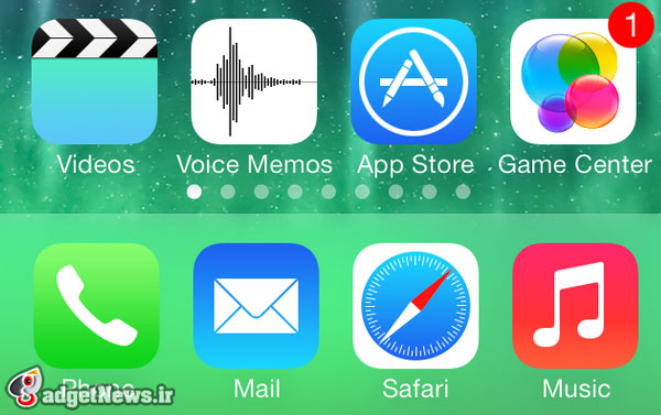
1 – Game Center
 GameCenterمرکز بازی iOS 7 همچنان از نبود قابلیتهایی همچون مشاهده اینکه دوستان شما در حال حاضر مشغول انجام چه بازیهایی هستند رنج میبرد. همچنین امکان برقراری ارتباط و ایجاد شبکه برای انجام بازیهای گروهی وجود ندارد.
پیش از عرضه iOS 7 تصور میشد که امکان انجام بازیها به صورت گروهی به آن اضافه خواهد شد، اما این اتفاق رخ نداد. به هر حال به نظر میرسد که تنها ویژگی جدید مرکز بازی iOS، تغییر لوگو باشد.
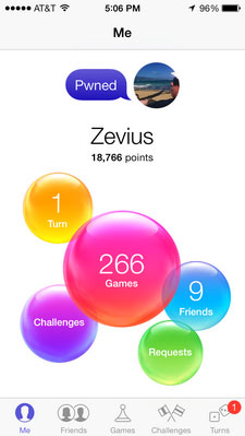
به نظر من لوگویی که اپل برای مرکز بازی سیستم عامل همراه خود انتخاب کرده، یکی از بدترین لوگوهای موجود است. من بسیاری از اوقات مشغول انجام بازی بر روی کامپیوتر شخصی، کنسول بازی و البته iOS هستم. ژانرهای مورد علاقه من نیز بازیهای مسابقهای، اکشن اول شخص و البته بازیهای کلاسیک دهه 80 میلادی است که نسخههای بروزشده آنها همین الان هم در دسترس علاقهمندان هستند. اما آیا میدانید تنها موردی که کوچکترین ربطی به ژانرهای مورد علاقه من ندارد چیست؟ حبابهای رنگارنگ!
درست است که بازی Candy Crush Saga یکی از محبوبترین بازیها در کل تاریخ است، اما این موضوع اصلا دلیل قانع کنندهای برای اقتباس لوگوی مرکز بازی iOS 7 از این بازی نیست. به نظر من بهتر بود اپل برای مرکز بازی خود یک لوگوی جامع طراحی میکرد تا کل ژانرهای بازی را پوشش دهد و نه یک بازی و یک ژانر خاص.
قطعا حبابهای رنگارنگ آن چیزی نیستند که زمانی که قصد انجام یک بازی را دارم، به آن فکر کنم و مطئنم که بسیاری از شما نیز با من موافق باشید.
2- عملکرد کند بر روی دستگاههای قدیمی
این موضوع مهمترین ایرادی است که به iOS 7 وارد است. چرا که خود من یک آیپد 2 دارم و مطمئنم که بسیاری از دوستداران اپل نیز صاحب یکی از همین دستگاههای اکنون قدیمی اپل هستند.
بر روی تبلت من، iOS 7 کار میکند و عملکرد دستگاه قابل قبول است، اما عالی و شگفتانگیز نیست. انجام هر کاری که فکرش را بکنید از بازکردن اپلیکیشنهای گوناگون گرفته تا بالا آمدن کیبورد برای تایپ کردن و حتی باز کردن بخش تنظیمات، بسیار کند تر از آنچه که در iOS 6 شاهدش بودیم صورت میگیرد.
نکته بسیار مهم دیگر این است که دستگاههای قدیمی، تمام ویژگیهای جدید را دریافت نمیکنند. برای مثال قابلیت AirDrop برای آیفون 4S عرضه نشده است. به نظر میرسد که iOS 7 اصلا برای این دستگاههای قدیمی بهینه نشده است.
3 – فقدان قابلیت تغییر طراحی کلی
 به شخصه، طراحی iOS 7 را میپسندم. میدانم که این طراحی زاده ذهن ساده پسند «جانی آیو» است. او عاشق طراحی ساده، استفاده از رنگهای روشن و آیکونهایRainbowBlast تخت و یکنواخت است. اما این همه ماجرا نیست. از بازخوردی که از نظرات کاربران پیرامون رابط گرافیکی iOS 7 گرفتهام، متوجه شدهام که اکثر کاربران اصلا علاقه ندارند هنگامی که وارد صفحهی خانه میشوند با انفجاری از رنگهای گوناگون مواجه شوند. ای کاش اپل از دو یا سه سری از آیکونهای گوناگون به جای آیکونهای رنگارنگ استفاده میکرد تا کاربران میتوانستند آنچیزی را که مد نظرشان است را انتخاب کنند. مشکل دیگر این است که در حال حاضر کاربران نمیتوانند شدت رنگ آیکونها را کم یا زیاد کنند. به نظرم تعبیه کردن این قابلیت کار پیچیدهای نیست و اپل میتواند در کمترین زمان، این کار را انجام دهد.
4- انیمیشنهای کند
حتی اگر از جدیدترین گجتهای هوشمند اپل استفاده کنید، با من موافق خواهید بود که انیمیشنهایی که هنگام باز و بسته کردن اپلیکیشنها نمایش داده میشوند، عملکرد کندتری نسبت به iOS 6 دارند. متاسفانه، کار به همینجا ختم نمیشود زیرا هر چه بیشتر با iOS 7 کار کنید، متوجه خواهید شد که این موضوع در مورد تمامی انیمیشنها صادق است.
5- استفاده بیش از حد از رنگ سفید
 WhiteTiredیکی از ویژگیهای طراحی جدید iOS استفاده از رنگ سفید در اکثر قسمتهای آن است. این موضوع چیز بدی نیست. اما وقتی که قصد دارم با آیفون یا آیپد خود هنگام شب و یا نور کم کار کنم، چشمانم به شدت اذیت میشوند.
این موضوع زمانی که قصد کار کردن با اپلیکیشنهای Notes، Reminders و Calendar در فضای کم نور را دارم، بسیار آزار دهنده است. میدانم که میتوانم شدت نور را با مراجعه به Control Center کاهش دهم، اما به نظر میرسد که بهتر بود این عمل به صورت خودکار صورت میگرفت.
6- عدم اعمال زبان طراحی جدید برای اپلیکیشنهای دیگر اپل
iOS 7 میبایست به طور کامل بازطراحی میشد. درست است که اپلیکیشنهای اصلی اپل دستخوش این تغییرات شدهاند، اما بسیاری از اپلیکیشنهای قدیمی از نظر ظاهری هیچ تغییری نکردهاند. برای مثال اپلیکیشنهای Podcasts، iBook یا Find My Friends هنوز شبیه به آنچیزی هستند که در iOS 6 بودند.
این نکته برای من بسیار تعجب آور است که چرا اپل باید بخش گستردهای از سیستم عامل خود را از نو طراحی کند ولی این کار را برای چند اپلیکیشن ساده خود انجام ندهد؟ البته به احتمال زیاد این اپلیکیشنها نیز در آیندهای نزدیک دستخوش تغییرات ظاهری خواهند شد.
7 – نبود حالت Landscape برای آیفونها
اگر یک آیپد داشته باشید، میدانید که هنگامی که تبلت خود را به طرفین میچرخانید، کل صفحه نمایش و عناصر موجود در آن از قبیل آیکونها نیز به طرفین میچرخند. بسیاری از اپلیکیشنها و بازیها نیز از این قابلیت که Landscape نام دارد، پشتیبانی میکنند. اما نکته شگفتانگیز در مورد iOS 7 این است که این قابلیت در حال حاضر برای گوشیهای آیفون فعال نیست و کار نمیکند. اما جای نگرانی نیست، زیرا این مشکل در آیندهای نزدیک حل خواهد شد.
نظر شما در مورد iOS 7 چیست؟ آیا دستگاه خود را به این نسخه از iOS بروزرسانی کردهاید؟
منبع : cnet
The 7 worst things about iOS 7
Yesterday I laid out my favorite new features in iOS 7, but today I need to vent about Apple's latest mobile OS and I hope you're willing to listen.
Yesterday, I wrote The 7 best things about iOS 7 to give you my favorite changes to Apple's mobile OS. But the update is not perfect by any means and I definitely have a few gripes with the new design, some of the apps, and other things that have not been improved. Read my full review of iOS 7 here .
I still recommend iOS 7 to anyone with an iPhone 4S or later and the latest iPad, but there are definitely a few things you're going to have to live with if you upgrade to the latest OS.
iOS 7
Game Center is bright and colorful, but it doesn't really reflect gaming in my opinion.
Game Center
Game Center already suffers from a lack of features, such as being able to see what your friends are currently playing, or ways to communicate with other players to team up. It's supposed to be a place where you can set up multiplayer games and find new games based on your interests, but it does neither very well at this point. In other words, Game Center needed an update for iOS 7, but all it got was a face-lift.
Even more troubling to me, however, is the facelift itself. I play games quite a lot on desktop, console, and, of course, on iOS. I play fast-paced racing games, gritty first-person shooters, epic adventure games, MMOs, and even some classic arcade compilations from the '80s. I consider myself an authority on the subject. Do you know what doesn't go with any of those gaming genres? Rainbow bubbles.
Sure, Candy Crush Saga is one of the most popular games of all time, but Game Center shouldn't let that be what drives the new design scheme. I'd like to see a Game Center icon and app design that is inclusive of all game types, with some race cars, guns, puzzles, soccer balls, and other things you find in games. Rainbow bubbles just aren't what I think of when I want to play a game, and I don't think I'm alone in that opinion.
Slow on older devices
This is easily my biggest complaint of everything listed here, probably because I own an iPad 2 and I know there are a lot of people out there with older iOS devices.
On my iPad 2, iOS 7 works, and the device is still usable, but it is far from perfect. Everything, from opening apps to bringing up the keyboard in Notes, to even just opening the settings is slower than it was in iOS 6. Every time I do any of these things, I have to wait a few beats longer to see the results. The overall feeling is much muddier than it was in iOS 6, which is saying a lot, because the iPad 2 was already a little slower than the new iPads, so any degradation in speed is going to be that much more noticeable.
It's also important to note that older devices don't get all the same features (no AirDrop for iPhone 4S, for example), but I think if iOS 7 is not optimized for a device or slows it down, it shouldn't be available for that device.
iOS 7
iOS 7 is extremely colorful and I like the new look, but maybe people should be able to tone it down a bit.
Let me change the design a bit
I like the new design. I really do. I know the that part of Jony Ive's vision was a simpler layout, bright colors, and flattened icons. That was clearly the point of changing the whole look. But I've heard enough from the chorus of commenters from my iOS 7 review to know that it isn't for everybody. Not everyone wants a rainbow blast from the home screen every time they open their iOS device. Perhaps if there were two or three icon sets to choose from, people could pick the one they liked best. Then, if you get sick of your current look, you could always switch it up for a whole new experience. Even if people could just tone down the current icon colors it would be better. It doesn't seem like it would be a hard thing for Apple to do and it would definitely make getting used to the new design much easier.
Slow animations
Even when you're on the latest devices, the zooming animations for opening and closing apps are a bit slower than they were in iOS 6. I actually like the zooming effects when I'm not opening and closing apps quickly, but it takes longer, for example, from the moment you hit the home screen button to when you actually get to the home screen. It's not a long wait, certainly, but as you browse around your iPhone or iPad, the slower animations add up.
The love affair with the color white
Part of the redesign is the use of more white space. I get it and I even like it. But the thing I noticed about it is that when I'm using my iPhone or iPad at night, the excessive use of white is tiring for my eyes.
iOS 7
The Calendar app (along with the redesign) looks great, but so much white makes my eyes tired at night.
Whether I'm looking at Notes, Reminders, or especially the Calendar, the bright white is too much for night-time viewing. I know I can easily adjust the brightness via the Control Center, but I feel like I shouldn't have to.
No design updates for other Apple apps
iOS 7 is supposed to be a complete redesign, and while all the core apps got the new design treatment, what about the other Apple apps? If you go to Podcasts, iBooks, or Find My Friends, you're going to see the same skeuomorphic, real-world designs you did in iOS 6. I guess it's not that big of a deal, but I wonder why Apple would change so many things but stop short of giving the iOS 7 look to all of its apps. Maybe we'll see redesigns of these apps in a future minor update.
Still no landscape mode for iPhones
If you have an iPad, you know that even when you're using the home screen, you can turn your iPad sideways and the Dock, along with all the icons, will turn to landscape mode with you. Why not on the iPhone? With so many apps and games that can easily switch to landscape, it would be much less jarring to come out of a game and have the home screen facing whichever way you're currently holding your iPhone. It seems like it would have been an easy fix for iOS 7, but we're still locked in portrait mode.