

براساس تصاویر منتشر شده توسط Android Police، سیستمعامل اندروید شاهد تغییرات اساسی در الگوی طراحی آیکونها خواهد بود که برگرفته از نحوهی طراحی تخت آیکونهای سرویسها و اپلیکیشنهای تحتوب غول جستجو است. هرچند آیکونهای جدید اپلیکیشنهای اندروید از آیکونوگرافی اپلیکیشنهای وب تبعیت خواهد کرد؛ اما از روی آنها کپی نشده و شاهد تغییراتی در ظاهر آنها خواهیم بود.
قبل از بررسی جزئیات آیکونهای موجود در تصاویر، بهتر است به این نکته اشاره کنیم که منبع منتشرکننده ی تصاویر، قطعیت استفاده از چنین آیکونهایی را در نسخهی آتی اندروید تأیید نکرده است؛ چراکه احتمالاً متخصصان گوگل در حال توسعه و کار روی این طرحها هستند و در این صورت شاید شاهد برخی تغییرات یا استفاده از الگوهای دیگری در آیکونها خواهیم بود.
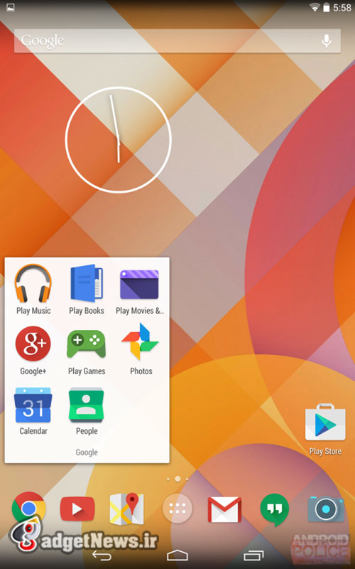
با نگاه به تصاویر فوق، میتوان از تصمیم گوگل برای یک بازنگری کلی در ساختار ظاهری سیستمعامل اندروید آگاه شد. در داخل کمپانی گوگل، استایل جدید به کار برده شده در نسخهی آتی با نام Moonshine شناخته میشود. در آیکونهای جدید شاهد استفاده از سایههای تیرهتر بههمراه رنگهایی با کنتراست بالا هستیم. همانطور که پیشتر نیز اشاره کردیم، علیرغم استفاده از الگوی طراحی آیکونهای متعلق به اپلیکیشنهای تحتوب، این آیکونها دقیقاً شبیه و کپی به آیکونهای مورد استفاده در سرویسهای وب نیستند. تنها فاکتور زمان میتواند نتیجهی این بازنگری کلی را مشخص کند.
در تصویر زیر میتوانید آیکون بازنگری شدهی اپلیکیشنهایی چون Play Music، Books، Movies، Google+، Calender، People، Chrome، Youtube، Maps، Gmail، Hangouts، Camera و PlayStore را مشاهده کنید.

نظر شما در مورد این تغییرات چیست؟
منبع : phonearena
Leaked screenshots reveal a possible upcoming huge Android redesign
Android might be up for a massive redesign with icons in the system taking a swing towards the flatter visuals of Google’s web visual identity, according to leaked screenshots obtained by Android Police. The new icons appear to be inspired by Google’s web iconography, but they are not direct copies, and some differ hugely from what’s currently on the web or on Android.Before diving deeper in the details, though, let’s say that this rumor gets a 70% confidence level by the source publication, since it’s not backed up by any system-level logs, and because it’s not clear how far Google is in the design process (which means Google might still change these icons a lot from what you see in the screenshots below).With this in mind, it’s clear that we’re looking at a fairly massive overhaul to the looks of Google’s operating system. Inside the company, this new Android style is allegedly referred to as ‘Moonshine’. Its key characteristics include the long hard shadows of icons and the generally more contrasted colors used throughout. As we already mentioned, it’s similar but not identical to the web icons. This discrepancy looks a bit strange, and it’s only logical to wonder whether it won’t entail a redesign in Google’s web design identity as well. Only time can tell. What seems clearer at the moment is that such a massive overhaul could – if it’s indeed true – bring changes to Android’s design guidelines, replacing the current square icon requirements as well.Right below, you’d see a breakdown of the new icons for: Play Music, Books, Movies, and Games, alongside Google+, Calendar, People, Chrome, YouTube, Maps, Gmail, Hangouts, Camera, and the Play Store apps. How do you like this possible new identity for Android?